Wednesday 30 November 2016

Photoshoot 6: Surrealism Location Portraiture: Straight Images -

Surrealism Location Portraiture 'Alice in Wonderland' - 


Alice in Wonderland:

1:


The above photograph is the second edit of image 1, below, with the addition of colour manipulation to the tree. 

These images are surreal in their colour manipulation to create a distorted landscape that links well to the theme of 'Alice in Wonderland'. The subject is also well focused and the composition is simple yet dynamic in the model being central in the rule of thirds grid. 


2:


The image above is the second edit of image 2, below, with the addition of minor colour manipulations to the trees. 

This image does not compositionally conform as much in its layout as image 1due to the inability to frame the trees equally on the vertical lines of the rule of thirds grid. However, the use of the two subjects makes an interesting narrative that can be understood in various ways by an audience. 


3:


Image 3 is an example of sequencing photography with two images having been joined using Photoshop to join two frames, with two images of the same subject, to create a surreal atmosphere. 

4:


The above image is a secondary edit of image 4, seen directly below, created through the addition of an extra colourisation treatment on more of the background. 

The colourisation is of a more vibrant hue and saturation and thus creates a more directly surreal final outcome. However, the subject is very static and posed in an unusual manner, which was planned to create a more surreal piece, but, could simply appear less aesthetically pleasing. 


5:


The photograph directly above is the second edit of image 5, which can be seen below, with the addition of colour manipulation  completed using Photoshop.

This image is variant to the above images in that the subject is much closer to the camera and within the left third of the rule of thirds grid. 


6:


This image is the secondary edit of the below photograph with the addition of colourisation techniques on the background to increase the colours in the foreground. 

The depth of colour and hue saturation of the image in the background adds a more surreal atmosphere to the image despite the subtle colour adaptions seen below. 


7:


The above image is a second version edit of the below image. Although, the first edit appears more surreal due to the autumnal colours that were present during the shooting. 

The composition is reminiscent of an album cover and is dynamic in the positioning in accordance with the compositional rule of thirds grid. 


8:


This image conforms nicely to the rule of thirds composition grid method with the subject at the vertical cross-sections meaning that the viewer focuses on them. Additionally, the leading line of the path takes the viewer on a surreal journey through the 2D art form. 

9:


This image appears more highly saturated than the others above and as such creates a more overt surreal element within the overall photographic outcome. The distance between the subjects also add a dynamic feature that once again takes the viewer on a journey through the medium. 

Tuesday 29 November 2016

Photoshoot 6: Surrealism Location Portraiture: Image Bank -

Photoshoot 6: Image Bank - 

Definitions: 
  • Surrealism:  A 20th-century avant-garde movement in art and literature which sought to release the creative potential of the unconscious mind, for example by the irrational juxtaposition of images.
Examples: 


(Tim Walker)


(Annie Leibovitz)


(Annie Leibovitz)


(Annie Leibovitz)


(Tim Walker)

Monday 28 November 2016

Photoshoot 5: Surrealism Change of Scale: Non-Studio: Work Diary Evaluation -

Photoshoot 5: Work Diary Evaluation - 

Equipment Used: 
Canon EOS 450D, standard lens, tripod. 

Settings: 
Beneath individual images.

Lighting: 
N/A. 

Theory: 
The surreal everyday.


Favourite(s):


(1/50, F/10, ISO 400, Manual Focus, No Tripod)

This image is one of my favourites of this series due to the successful satirical humour which is also employed by the photographer Slinkachu whilst using elements of Yorch Miranda's technique. The foreground blurring through depth of field was successful too in that it leads the viewers eye into the work and to the subject. Also, the lighting is one of the best examples within the series which means that the subject matter is clear. 

If I were to complete this image again, though, I would capture the photograph at either a different time of day when the natural lighting is at its best or in a studio environment. This would be to improve the natural lighting and to remove any distracting features such as the design on the backdrop. Furthermore, the above photograph was edited in Photoshop to remove some of the hello lighting that accompanies shooting in non-studio indoor locations; I did this by increasing the blue hue to neutralise the yellow. However, I would have liked to keep the natural hue as much as possible to avoid bringing out the darker shades in the subject. 


(1/30, F/10, ISO 800, Manual Focus, No Tripod)

The above photograph is in the better of the series due to its composition and natural lighting. The location that this image was captured in allows more natural lighting in and meant that subsequent editing to change the hue was not needed. Additionally, the composition is better as a result of the cropping and compliance to the rule of thirds grid with the subject sitting at the cross-section of the vertical left third of the grid. 

Despite this, this image could be improved by experimenting with various focal lengths due to the focal length used reducing the area of focus on the scenery and being more focused on the subject. As such I could have used various focal lengths to achieve different and varied outcomes. 


(1/10, F/8, ISO 800, Auto Focus, Tripod)

This photograph is also within the best of the series due to its direct relation and having taking inspiration from the work of Yorch Miranda. For instance, the location of the photograph is one also employed by Miranda although the meanings of the work vary in that I used photographs of the common people opposed to Miranda's vintage images of workers. 

The improvement of this image would be routed in the lighting and subsequent editing to reduce its dull and mono tonal current state which may not aesthetically fit as well with the other images. As such I could have shot in various locations and lights to ensure the best natural lighting for the image as increasing the exposure through means such as 'Levels' or 'Curves' in Photoshop could add unwanted noise and graininess.  


(1/8, F/8, ISO 800, Manual Focus, Tripod)

Penultimately for favourites, the above image is in the top percentage of favourites of shoot 5 in respect of its execution and ideas behind it. This image was a symbolic image in that its surrealism tells a story of irony. The 2D image is in a 3D frame which is made 2D by being captured in another photograph. Moreover, the other idea is a comment about humanity and how we so easily become trapped like a pinned butterfly.

However, the composition of this image could have been improved to fit the square crop that was completed post-rpdouction. Had I taken more consideration when taking the initial photographs then the composition could be more aesthetically pleasing once within square framing. Although, the supposed lack of composition could be symbolic in itself. For instance, the subjects within the photograph are arranged chaotically with the surrealist idea that art is not solely for the means of being aesthetically pleasing but also to challenge to conformity and such the image challenges the ideas of the rule of thirds compositional grid method or the fibonacci circle. 


(1/20, F/8, ISO 800, Manual Focus, Tripod)

Finally, this is the last of the favourites within this photoshoot and is so because of the lighting and focus on the subject. Shooting outdoors provided the natural lighting that had been the target for the other photographs and as such meant that it was easier to focus the photograph using manual focus. 

The only improvements that I would make on this image would be to reduce the contrasts between the tonal variations so that the background is not as stark in its transition from sky to background. 

Least Favourite(s):


(1/8, F/8, ISO 800, Manual Focus, Tripod)

The above image is a least favourite within this series due to the non-studio element of natural lighting which was poor whilst shooting indoors meaning that images were either of a very hello tone of had flash reflections. The camera flash meant that details are taken away from the subject as the eye is taken immediately to the light reflection. Also, the composition was not a desired and could have been considered more carefully to fit a square frame.

As such, to improve this image then I would choose a time of day when the natural light is at its brightest and shoot without flash. I would also crop and edit the image into a square ratio to fit the others.  


(1/20, F/8, ISO 800, Manual Focus, No Tripod)

The above image was not one of the best within this photoshoot due to the poor lighting, the reflection of flash and the composition. The flash detracts from the subject of the image whilst the composition is very static and hardly dynamic for a moving prop. 
 
Evaluation and Development -
 
Elements of this series were successful but the unpredictability of the non-studio environment such as the lighting resulted in some photographic images that were not of the desired standard.
 
I believe that I may have now exhausted the use of changing the scale of subjects in respect of the Yorch Miranda style within my limited models.
 

Saturday 26 November 2016

Photoshoot 5: Surrealism Change of Scale: Non-Studio: Straight Images -

Photoshoot 5: Straight Images - 


Scale Manipulation Non Studio:


This image is successful in the composition in that the focus is on the model with the depth of field blurring the foreground so that the eye goes immediately to the subject. The idea was also good in its satirical surreal response. The lighting was not as desired in that it became too warm hence the editing in Photoshop to add more blue hue to neutralise it. This image was also cropped down so that the composition and overall image fitted better within the frame. 


The above photograph is not as successful due to the difficult nature of the location. Reaching the appropriate level whilst keeping sufficient lighting was difficult and as such the non-studio lighting gave the image a non-naturalistic yellow tone. This was attempted to be mended in Photoshop through the means of increasing the exposure and emphasising the natural blue hues to neutralise some of the yellows. 


This photograph is better, in some respects, than the image directly above due to the natural lighting and composition. The lighting is more naturalistic making the subject of the image more natural to provide a direct contrast to the distortion of reality in the change of scale inspired by Surrealism. 


This image employs levels well and the rule of thirds grid to create a better outcome that works well within the series of square final outcomes. The lighting is more natural than the first two photographs and the subject sits on the left vertical line of the compositional grid. 


The above image in directly inspired by a piece created by the photographer Yorch Miranda but adapted to fit my theme of surrealism without underlying ideologies; I believe that Yorch Miranda's workers in a shirt pocket is a statement about the situation of society and how the workers are in the pockets of the bourgeoisie. Despite this, the overall image of mine is not riddled with ideologies but instead serves as a surreal piece without a direct meaning. The image itself is somewhat dark and underexposed due to the non-studio environment and lack of lighting source. 


Much like the aforementioned photograph, within the same location using the same prop, the result is underexposed and monontonal which could be amended even more tun is currently using Photoshop although increasing the levels or curves could have an impact on the subject in the photograph. 


Once again this image is too dark and the rectangular composition is not as effective as the square crop version which reducers the canvas size meaning that the rule of thirds grid is smaller and the placement of the subjects is much more vital. 


The photograph seen above is one of the lesser successful due to the practical image opposed to the successful theoretical ideas behind it. The lighting and, as a consequence, the focus is somewhat off meaning that the overall effectiveness of the image is hugely impacted. The surreal change of scale employed in this image may be served better by being taken in a studio environment where the lighting can be controlled more accurately. 


This image, including the two below, were a result of a culmination of surreal ideas. The first being the idea of a photograph being almost surreal in its own nature as it is a 2D rendition of something that is 2D which lead to my idea of capturing an image in which the role of the subject as a 2D printout could be utilised for surreal purposes. 


The second idea was that a satirical humour could be found by placing a 2D photograph in a 3D frame and then photographing it thus turning it into a 2D art format. 


Finally was the idea that the model could be used in accordance with other props that are also surreal. Butterflies are often featured in surreal works due to their bold vibrant colours but I wanted to employ them the play with the ideas of dimension but also to embed theory behind the work in that a statement about humanity being little different to animals could be made. 

The lighting was also successful in the above three photographs in that the room used had better access to natural lighting and the cameras flash could be used without impacting greatly on the overall effect of the image. 


The above image is not as successful due to the ever present non-studio element of poor natural lighting. The camera flash meant that details are taken away from as the eye is taken immediately to the flash. 


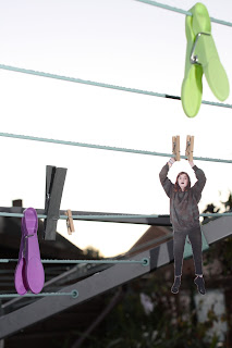
This image is one of the more successful in that its location being outside was well lit and flash could be used without overpowering the lighting. This also allowed details to be exaggerated and others to be lost in the background. The composition was also successful in this photograph with the model within the central column of the rule of thirds grid. 


Again this image had good natural lighting and as such the details of the subject show up well making the surreal nature of the image more easily noticeable. The composition of the image is interesting in that the model is not in the central column of the compositional grid but is instead within the right third. 


The above image was not one of the best within this photoshoot due to the poor lighting, the reflection of flash and the composition. The flash detracts from the subject of the image whilst the composition is very static and hardly dynamic for a moving prop. 


Finally, this image is again less successful than some of the above images although the lighting is better than the image directly above in that the flash worked well within the environment and the subject is fully in focus. Despite this, the idea again is not as surreal as some of the others such as the butterfly images.