Equipment Used:
Canon EOS 450D, standard lens, tripod.
Settings:
1/125, F/16, ISO 200.
Lighting:
Fill lights.
Theory:
The reflections of ourselves lie routed in those who form our past, present and future and as such we are shaped by our peers.
Favourite(s):

This image is the secondary edit of image one which is a culmination my own ideas and a combination of John Stezaker's technique also inspired aesthetic of Lucas Simoes. The cut between layers works well due to the geometric shapes inspired by the work of Lucas Simoes and the alignment of images helps to exaggerate this.
However, to improve this final outcome I would only make subtle changes such as lighting on my own photograph. The other photographs in the series were edited to match the colourisation, saturation and lighting of the original images and this is the steps I would take to change this image.

The above photograph is successful in that the composition of layering five individuals over the original image was difficult due to scale, pose and positioning yet it turned out aesthetically pleasing. The secondary layering uses just enough of the image whilst allowing the original to show through which means that the technique is not obscuring the surrealist undertones.
Although, the layering ends halfway down the image without continuing in a cohesive manner; this was initially an aesthetic choice to match the angular and sporadic cutting of the images yet it could be assumed as not relating to artistic licence.

Finally in relation to favourites, this photograph is a positive final outcome due to the alignment of the images and the initial composition which allows for the images to merge and create an emphasised surreal image. Moreover, the decision to edit only one subject was a compositional deviation from all other images within the series but appears very successful.
As a result, the link between this image and others could be questioned yet the replicated use of technique, colourisation and lighting all play a significant role in ensuring that the cohesive nature of the series can be recognised by either style or themes.
Least Favourite(s):

This is one of my lesser favourites in that the alignment is off centre, the scale is different and the background is distracting from the subject which is not present in the more simplistic original images chosen. Also, the colourisation is varied and as such the images do not work as well as a cohesive final outcome created from juxtapositional photographs.

This image is most effective in that the poses of the subjects match the original closely and as such create a more dynamic final outcome. Furthermore, the editing technique of matching the secondary layer to the blue hue of the original; makes the image work well as a final outcome.
Although, the scale is off and the amount of original image showing through the secondary layer is also off. Consequently, the image could be formed more accurately and create a piece that works so well together as exemplified in either the first image or the third image.

The photographic outcome seen above is successful in the careful consideration of scale and similarities needed between the shoots to create a cohesive link that works well as a juxtaposition simultaneously.
Despite this, the secondary layer is too prominent when compared to the older photographic image and this could be amended in the editing process where I could either fade the second image or remove more using the masking technique.
Photoshop Process -

I began by unlocking the layer to allow the process of editing.

I repeated the process of unlocking the layer on my second photograph to allow for the images to be edited together.
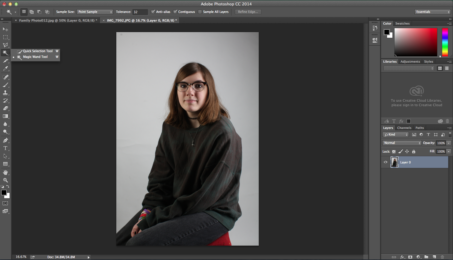
I then hovered over the 'Magic Wand Tool' (W) and selected the previously named tool.

I selected the unwanted areas by holding down the shit button to keep the current selection and add more of the background to it.

This is the completed selection where I then simply pressed the 'Delete' button on the keyboard.

The image should then depict the subject on a transparent backdrop like shown above.

Move up to the 'Select' drop down menu and then choose 'Deselect' (Cmd, D).

Next, I dragged the secondary layer over to the initial layer. The scale could be marginally, or in this case dramatically, off and needed to be fixed.

The change of scale was completed by moving over to the 'Edit' menu where I then chose 'Transform' closely followed by 'Scale'. To complete this function more accurately I held down the 'Shift' button whilst changing the scale to keep it within its original ratio.

This is the image now at the desired scale and after having been aligned with the base photograph. I also moved down to the 'Add Layer Mask' option and selected it which places a white box next to the secondary layer on my list of images shown on the right.

The next step in the process was to hover over the 'Brush Tool' (B) and zoom in (Cmd +) so that I was able to remove the small sections of the background that remained on my secondary photograph. To do this I used the black paint on top of the layer mask; if the colours are the wrong way around they can be reversed by hitting (X). Black is used to make items invisible on a layer mask whilst white makes them visible. As such, if any mistakes are made such as erasing too much of the image then it can be amended quickly and easily or non permanently using the white paint.

Once more I moved over to the tool bar and hovered over the 'Lasso Tool' (L) and chose the 'Polygonal Lasso Tool'.

I then created polygonal shapes on areas of the image that I planned to make invisible utilising the black paint on the layer mask.

After the polygonal selection was made I returned to the 'Brush Tool' (B) where I painted black within the outlined area and removed the section which can be seen in the step below.

After this I simply moved to the menu bar and hit 'Select' followed by the final step of 'Deselect' (Cmd, D). The final four steps can be repeated until all desired sections have been removed.
Sepia Effect -

For the images requiring a sepia effect I ensured that I was on the appropriate layer and that I was in fact on the photograph and not the layer mask if one is present. I then moved up to the 'Image' option and then chose 'Adjustments' followed by 'Desaturate' (Shift, Cmd, U).

Desaturating the image made it black and white. Stop here if that is the desired outcome but for a sepia effect editing needs to continue.

Once again move to the 'Image' drop down menu and chose 'Adjustments' but this time instead click 'Photo Filter'.

The default setting should be appropriate for a simple sepia effect and the only changes that I made were to the 'Desnity' slider value. Simply select 'OK' and finish.
Evaluation and Development -
This series is, as a whole, possibly my most successful as of yet. The technique that I have developed from the inspirational conceptual artist John Stezaker is one of the most successful ones that I have explored so far. The final outcome is the most fine art based that I have produced within this project and is one that I am happy to show as my work.
The skill is an enjoyable yet lengthy one that has taught me how to use layer masks correctly and is one skill that I may continue to use either in another Photoshoot or a print technique or computer experiment.
No comments:
Post a Comment